Core Components
React Native provides mobile components which can be used to create mobile apps Some of the most common core components are:
<View>- container that supports layout with flexbox<Button>- basic button component<Image>- component for displaying images<TextInput>- component for text input
View
View is a container component that supports flexbox layout. It is used to group and structure other components within your application.
import { View } from "react-native";

return (
  <View style={styles.container}>
    <View>
      // Components
    </View>
    <View>
      // Components
    </View>
  </View>
);
For more information and examples, refer to the official documentation https://reactnative.dev/docs/view.
React Native provides also <ScrollView> component that is generic scrolling container (https://reactnative.dev/docs/scrollview).
Text
Text is a component for displaying text.
Using the Text component:
Import the Text component from React Native.
import { Text, View } from "react-native";
Render the Text component.
return (
  <View style={styles.container}>
    <Text>This is text</Text>
  </View>
);
You can use Text component's style prop to define font size, font weight etc. For example,
return (
  <View style={styles.container}>
    <Text style={{ fontSize: 18, fontWeight: 'bold'}}>This is text</Text>
  </View>
);
For more information and examples, refer to the official documentation https://reactnative.dev/docs/text
Button
Button component provides a basic button for user interaction
Using the Button component:
Import the Button component from React Native.
import { Button, View } from "react-native";
Render the Button component. The onPress prop specifies the function that will be called when the button is pressed. The title prop sets the text displayed on the button.
return (
  <View>
    <Button onPress={buttonPressed} title="Press me" />
  </View>
);
Pressing the button will show an alert. Note: You have to import also Alert component. Read more about Alert in https://reactnative.dev/docs/alert.
const buttonPressed = () => {
  Alert.alert("Button pressed");
};

- For more information and examples, refer to the official documentation https://reactnative.dev/docs/button
Pressable
Button component support limited level of customization. You can use the Pressable component to build your own button.
For example, to get rounded red button:
import { Pressable, Text, StyleSheet } from 'react-native';

const RoundedRedButton = () => {
  return (
    <Pressable
      style={({ pressed }) => [
        styles.button,
        { backgroundColor: pressed ? 'darkred' : 'red' },
      ]}
      onPress={() => console.log('Button pressed')}
    >
      <Text style={styles.buttonText}>Press me</Text>
    </Pressable>
  );
};

const styles = StyleSheet.create({
  button: {
    borderRadius: 25,
    paddingVertical: 10,
    paddingHorizontal: 20,
    justifyContent: 'center',
    alignItems: 'center',
  },
  buttonText: {
    color: 'white',
    fontSize: 16,
  },
});

export default RoundedRedButton;
For more information and examples, refer to the official documentation https://reactnative.dev/docs/pressable
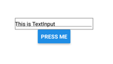
TextInput
TextInput component allows users to enter and edit single or multiline text.
Using the TextInput component:
Import the TextInput component from React Native.
import { View, Button, Alert, TextInput } from "react-native";
Create a new state where typed input is saved.
const [text, setText] = useState("");
Render the TextInput component.
<TextInput
  placeholder='Enter some text'
  onChangeText={text => setText(text)}
  value={text}
/>
The placeholder prop sets the placeholder text that appears in the input field when it's empty.
The onChangeText prop specifies the function that will be called whenever the text input changes. This means that whenever the user types something into the input field, the text state will be updated with the new value.
The value prop sets the value of the input field. In controlled components, this prop is usually tied to a state variable that holds the current value of the input.
Then, we define handlePress function that shows text state value using the Alert component.
const handlePress = () => {
  Alert.alert("You typed:" + text);
};
Finally, import and render the Button component.
<Button onPress={handlePress} title="Press me" />
After entering text into the input field, pressing the button should trigger an alert displaying the text you've typed.
For more information and examples, refer to the official documentation https://reactnative.dev/docs/textinput
Image
Image is a component for displaying images
Using the Image component:
Import the Image component from React Native.
import { View, Image } from "react-native";
Render the Image component (local image). You have to manually define width and height for the image.
<Image
  style={{ width:250, height: 100 }}
  source={require('./img/haaga-helia.jpg')}
/>
In the case of remote URI image, the source is defined in the following way:
source={{uri: 'IMAGE_URI'}}

Safe area
"Safe area" is the part of the screen that is not covered by things like the status bar or home button on your device. It makes sure that important parts of your app are always visible and not hidden by these elements.
React Native provides SafeAreaView component but that support only iOS devices.
You can use the react-native-safe-area-context library (https://docs.expo.dev/versions/latest/sdk/safe-area-context/), which supports both iOS and Android devices. This library provides a SafeAreaView component that works across platforms.
Installation:
npx expo install react-native-safe-area-context
Usage:
import {
  SafeAreaView,
  SafeAreaProvider,
} from 'react-native-safe-area-context';

function MyComponent() {
  return (
    <SafeAreaProvider>
      <SafeAreaView>
        <Button title="Press Me" onPress={doSomething()} />
      </SafeAreaView>
    </SafeAreaProvider>
  );
}
SafeAreaView component is regular View component that use padding to set safe area.
For additional core components, refer to the following link https://reactnative.dev/docs/components-and-apis